
Big Whiners
Jose’s Thinking about design today on Brand Showdown and had quite a bit to say about how Stormhoek is dealing with the challenge as compared to Daimler Benz. Thanks Jose!


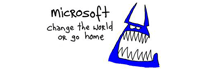
The 2006 Dodge Charger – a vehicle that has Charger enthusiasts whining about the design to Daimler-Chrysler execs, vs Stormhoek – a south african winery that is using the power of bloggers to design its
labels and bottle.Todays matchup is a no contest, hands down win to Stormhoek. With their web savvy, long tail approach to designing new labels and bottles to hold their fresh tasting wine, these Davids of the wine industry are the buzz of the internet. With Hugh Macleod leading the bloggers charge these South Africans via New Zealand upstarts are stomping the grapes of crappy overdone marketing and making waves of
good wine through the stuffy ranks of the oenophiles . Stormhoek has opened up a public call for new label and bottle designs with a nice cash reward.Annnnd in the losers corner is the new Dodge Charger, I can hear some of you saying,”I didn’t know there was a new Dodge Charger”. Well thats the point. The buzz that generated some great sales for the new Ford Mustang design was heralded as a triumph because they created a new vehicle with historic compliments to the old design. Unfortunately Charger fans don’t share the same sentiment. This guy was so ticked he started a website and actually got a letter writing campaign to the heads of the project and the company. Read them and it’s obvious why Dodge Charger fans are whining and Stormhoek fans are winning.
Your most powerful design team (your customer) is waiting around a corner to either trumpet your success to the world or yell your failures. You better hope they have helped build your new car/wine. Another piece that makes this so powerful is that Stormhoek is a small company that can zig and zag to make changes whereas Daimler Chrysler is so big they are buying companies to stay afloat.
So be small, let your customers be designers, and remember… are you doing something because everyone else is doing it, or because no one else is doing it. Think about it!
Thanks Jose for your vote on our open source view to packaging redesign. It has been said that the future of advertising is internal and this is certainly one of those examples. The exercise has changed what we think our bottles should look like.
Jose wants to know more about where the name came from. Stormhoek means Stormy Cape, in Afrikaans. The word dates back to the 1600’s when the Dutch were settling the area. It is strong, memorable and represents a spit of land that juts into the ocean from the Cape of Good Hope. Most of all, we liked it and it dose give a sense of realness to how challenging producing wine is in our stormy corner. Of course, we wanted to avoid the potential of Afrikaans Faux Pas that have been made by many of our neighbors by not using impenetrable names such as boekenhoutskloof and Buffeljags, who first need to offer Berlitz lessons to any prospective western consumer.


One Comment, Comment or Ping
thinkjose
Thanks guys! Waiting with anticipation for the US launch.
Nov 14th, 2005