
Collective wisdom
Our Packaging Update and
Please don’t tell the competition
I Spent a bit of time at the LIFT conference last week and there was some really good discussion on the subject of open source design. It reminded me that we have been remiss in not posting an update on what is happening with ours. Not to mention there is still a grand riding on the outcome, so presumably those people who were kind enough to submit, want to know what’s up.
For the benefit of some of our new friends, Hugh ran a post in November about our efforts to redesign our label. We had lots of people post on the wiki and email us everything from a few thoughts, to full design briefs.
Collective Wackiness?
Based upon comments in the trade, many of the folks in the business thought we lost our marbles – after all, wine label design is a specialized art and most producers pay big bucks to have the ‘right’ designer do their stuff. That might be true, but we felt we were onto something here.
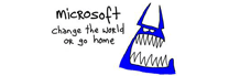
When Hugh posted that we asked why our competition shouldn’t be Microsoft or Google, many people didn’t (and still don’t) get it. But Robert Scoble over at Microsoft got it and had his spin on it. As did, people like Brian Moffatt.
Many Weigh In
There were comments about using clear bottles only, using new types of print tech that allow a face on the bottle to follow someone as they pass by the shelf. Embedding our ‘wired’ connection into the label, using phrases like “Blog This”. There was a particularly impressive interpretation of the freshness indicator suggested as part of a very vodka-ish package—let’s face it lots of vodka packages are far more creative than wine packs – so a point was made with that suggestion.
There were in total, well over 100 responses (some were emailed), but what was most interesting, was what people didn’t suggest: Put a picture of the winery on the label. A cool pic of the chateau would be great (there isn’t one) or, oh, grape vines, please put grape vines, the vineyard, etc. Or, don’t you guys have a family crest?
The Silence Was Deafening
We couldn’t agree more and what lots of producers from all over the world don’t seem to get is that their area of production (fill in the blank) is very beautiful. Grapevines (with a few exceptions I can think of) are grown in very beautiful places. It appears that beautiful imagery doesn’t differentiate anymore.
(Note to Competitors: We gather that (y)our consumer in Des Moines or Manchester doesn’t give a toss about your new $100 million winery)
The exercise highlighted how difficult the job is. From it all, we surmised that people think that the new package should:
1) Stand out (at all costs)
2) Incorporate imagery that goes beyond the standard wine stuff
3) Be in a cool bottle, if we can afford to.
Pretty simple, eh?
Not really. We spent weeks pulling our collective hair out and Hugh posted a follow up. More responses with the same overall message.
Well, I am sorry to report that we still do not have an answer, but here is what we are thinking:
1) Great wine needs to be more about real life and lifestyle, less about what temperature its fermented at and what time of day the grapes were picked.
2) Wine by definition changes with every vintage and in that way and many others, it is a bit of fashion, which of course, changes with the seasons as well.
3) People seem to like that Stormhoek has become about ‘the conversation’ and it needs to continue to provoke one. There seems to be a consensus that wine should be about what happens ‘AFTER’ you open the bottle.
4) Make it special: Wouldn’t it be nice if we could make a $10-12.00 ‘object of desire’? *
We are continuing to work on the project and are looking at ‘other’ wine and non wine products that might give us some inspiration. Let us know if you have any suggestions.
In the meantime, we are expecting to post some visuals in the next few weeks for comment, so stand by.
* Credit to Alex Bellinger for this one.


4 Comments, Comment or Ping
john
Re your pretty simple 1,2,3 – well yes it is pretty simple – they’re all saying the same thing “stand out” .
That’s why I made the very simple suggestion of running the stormhoek name vertically. Something that basic will make the bottle visually arresting and on the shelf that’s pretty much all you can ask for given the visual noise you’re having to cut through.
All the other points are salient, but if you don’t stand out they won’t be noticed. Maybe they can be addressed in a way that is accessible to the consumer once they have picked up the bottle, or maybe it will be accessible via the blog being cited on the label but, as you’re discovering, to hit all those buttons is a very big ask via label design.
Feb 8th, 2006
john
P.S. Having just opened a bottle, it struck me that it might be argued that there is an inherent dissonance between your aim of creating an object of desire (presumably the unopened bottle) and the assertion with which I agree that the important thing is what happens after the bottle is opened.
Incidentally, I recall an australian wine company focussing on just that element in a series of spots it ran on channel 4 as part of its sponsorship of one of the american shows, Friends, Sex and the City I don’t recall which one – which just goes to reinforce my personal views on the value or otherwise of sponsoring TV shows – much beloved by agencies who make high commissions.
Feb 8th, 2006
jason
Yes, Stand out, Stand out Stand out!!! Vertical is something that we are looking closely at and there are a couple of people here who strongly agree with you on that. I am waiting to see how it looks on the new bottle.
You have a point about the dissonance between ‘object of desire’ and the notion of what happens after the bottle is opened. However, I do not see them as necessarily inconsistent as if something looks and feels great, why shouldn’t it be a conversation piece as it sits on the table? We see that with a lot of ‘luxury’ goods these days, I think..
BTW- I think that its Jocobs Creek?
Feb 9th, 2006
john
I think you’re right Jason about the consistency – whilst I might not agree about the bottle as conversation piece it certinly can be an object of desire in the sense of it being the embodiment of the post-opening experience.
Yes it could well have been Jacob’s Creeks – focussing on a theme of enjoying it with Friends.
Feb 12th, 2006